How to Create an Effective E-Commerce Landing Page?



Most stores send paid traffic to a product page and wonder why conversion stays flat. The product page was built for browsing. A landing page is built for one decision. So how do you create an e-commerce landing page that converts?
Start with the distinction that governs everything else.
A product page sits inside your catalog. It carries navigation, related products, category links and every path a visitor might want. It serves someone exploring.
A landing page removes all of that. One offer, one audience, one action, with no exits beyond the button you want pressed.
That removal is the entire mechanism. Every link you leave on the page is a reason for someone to leave it.
Four elements structure a page that works.
A headline matching the ad that brought the visitor there. A mismatch between what your creative promised and what the page delivers produces the bounce you blame on traffic quality.
A single offer, because a page presenting three products converts worse than three pages presenting one each.
Proof positioned early, meaning reviews, photographs and counts placed above the fold rather than buried under specifications.
One call to action, repeated down the page, phrased identically every time.
One thing deserves stating before the detail. Your page cannot fix a product nobody wants, and the best-converting landing pages are built around offers that were already working.
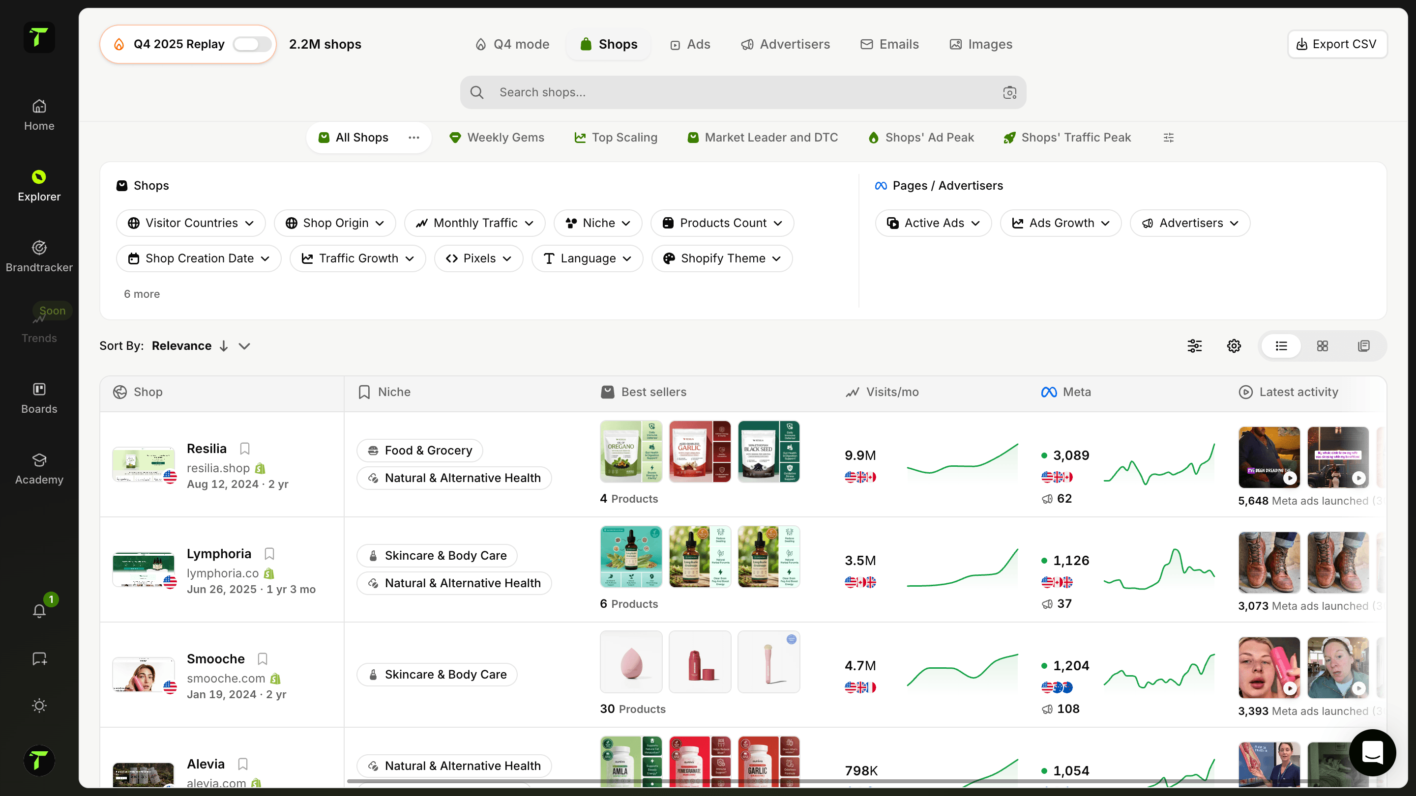
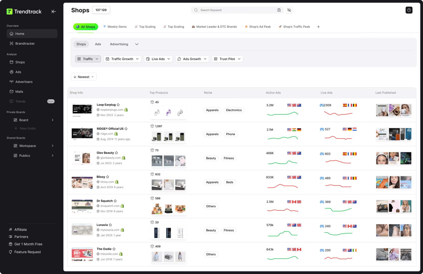
At Trendtrack available at app.trendtrack.io/en/sign-up, we index 95 million TikToks and preserve full ad history across Meta, TikTok and Google.
In this article we break down each element.
What Is an E-Commerce Landing Page?
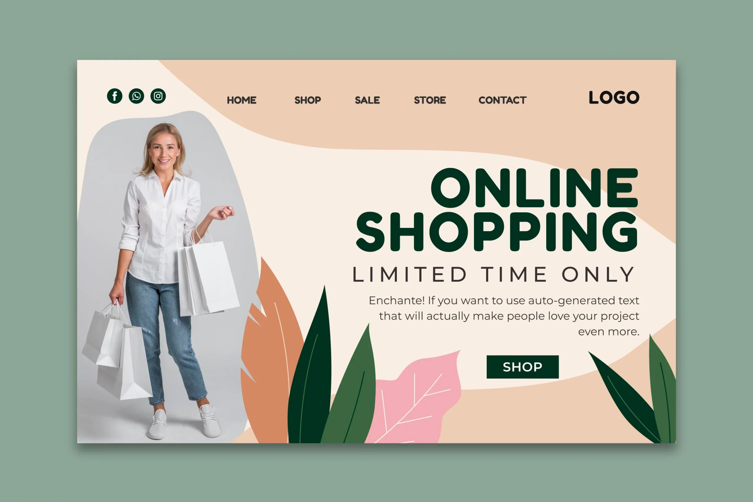
An e-commerce landing page is a standalone page built for one offer and one action, where visitors arrive from a specific traffic source.
The defining characteristic is what it removes rather than what it contains.
A product page belongs to your catalog. It carries your main navigation, category links, related products, cross-sells and a search bar. All of that exists because a browsing visitor might want any of it.
A landing page strips those paths out. No menu, no related products, no category links. The only meaningful action available is the one you want taken.
That removal is the mechanism, not a stylistic choice. Every exit you leave on the page is an exit someone will use.
Three further differences follow from it.
Traffic source. A product page receives visitors from search, navigation and direct links. A landing page receives traffic from a specific campaign, which means you know what brought them and can match the page to it.
Message continuity. Because you know the ad, you can repeat its promise in your headline. A product page cannot do this, since it serves every visitor identically.
Measurement. One page, one offer, one conversion event. Attribution becomes clean, and A/B testing becomes meaningful.
Three formats cover most e-commerce use cases.
The product-focused page, built around a single item with a strong offer.
The collection or bundle page, presenting a curated set with one combined call to action.
The advertorial, which reads as content before converting, used on products requiring explanation.
One clarification: a landing page does not replace your product pages. It complements them, handling paid traffic where intent is specific.
What Makes a Landing Page Convert?
Six elements do the work. The first matters more than the five below it combined.
Message match with the ad
Your headline must deliver what your creative promised.
A visitor who clicked on a specific claim and lands on a generic product title experiences a disconnect they cannot articulate. They leave within seconds, and you record it as poor traffic quality.
Write the headline from the ad, not from the product.
A single offer
A page presenting one product converts better than a page presenting three.
Choice creates hesitation, and hesitation on a landing page produces exits rather than deliberation. If you have three products worth promoting, build three pages.
Proof above the fold
Reviews, customer photographs, ratings and counts belong near the top, not buried under specifications.
A visitor arriving from an ad has no relationship with your brand. Proof is what substitutes for that relationship, and it has to appear before they decide to scroll.
One repeated call to action
Use the same wording every time it appears.
Varying the phrasing between buttons introduces doubt about whether they do the same thing. Repeat it identically, down the page, at every natural decision point.
Mobile-first construction
Most paid traffic arrives on a phone, which makes mobile the default rather than an adaptation.
Check load speed specifically. A page taking four seconds loses visitors before your headline renders.
Friction removed from the path
Every field, every click and every unexpected cost between the button and the confirmation is a place people abandon.
Shipping costs revealed at the final step remain the most common cause.
How to Structure Your Landing Page?
Eight sections, in this order. The sequence matters as much as the content:
Hero with headline, image and call to action
Proof bar directly beneath
Problem the product solves
How it works
Benefits with visuals
Reviews and customer photographs
Objection handling
Final call to action
The hero carries most of the decision. Your headline repeats the ad promise, your image shows the product in use rather than on white, and your button sits visible without scrolling.
A visitor decides whether to continue within seconds, and this section is all they have seen.
The proof bar follows immediately: star rating, review count, customers served, guarantee. One line, high on the page, before anyone has scrolled.
The problem section earns attention from visitors who are not yet convinced. State the situation they recognise rather than the product you sell.
How it works reduces uncertainty. Three steps, illustrated, showing what happens after purchase. This matters more on products requiring any explanation.
Benefits translate features into outcomes, each paired with an image. Avoid specification lists here; they belong further down if at all.
Reviews with photographs outperform text reviews substantially, because they answer the question every online buyer carries: does it actually look like that?
Objection handling addresses what stops people buying. Shipping time, sizing, returns, compatibility. Treat it as an FAQ positioned where hesitation occurs.
The final call to action restates the offer and repeats the same button wording used throughout.
One structural rule governs all of it. Place a call to action after every major section, so the decision is always one click away rather than requiring a scroll back.
Common Landing Page Mistakes to Avoid
Several errors appear repeatedly, and most cost conversions without producing any visible signal.
Keeping the full navigation on the page
Writing a headline disconnected from the ad
Presenting multiple products instead of one offer
Burying proof below the fold
Varying the call-to-action wording between buttons
Designing for desktop when traffic arrives on mobile
Loading slowly, above three seconds
Revealing shipping costs at the final checkout step
Listing specifications instead of outcomes
Launching without testing anything
Among these, keeping the navigation is the most common and the easiest to fix.
Store owners leave the menu in place because removing it feels wrong. It is a shop, after all.
But every link is an exit, and a visitor arriving from an ad with specific intent does not need to browse your catalog. They need to decide on one thing.
Headline disconnection causes the bounces most often blamed on traffic quality.
Someone clicked on a specific claim. If your page opens with a generic product name, they experience a mismatch they cannot name and leave within seconds. Your analytics show a bounce, not a message problem.
Hidden shipping costs remain the leading cause of cart abandonment across e-commerce.
A visitor who reaches checkout has already decided. Revealing an unexpected cost at that moment converts a buyer into someone who resents you.
State shipping on the landing page, even if it is not free.
Launching without testing compounds every other mistake, because you never learn which one is costing you. One headline, one layout, one offer, and no data on whether any alternative works better.
What Separates a Good Landing Page From a Bad One?
The same product, the same traffic and the same budget produce very different results depending on these choices.
Good versus bad landing pages
| Element | Bad landing page | Good landing page |
|---|---|---|
| Navigation | Full menu and category links | Removed entirely |
| Headline | Generic product name | Repeats the ad promise |
| Offer | Several products presented | One offer, one decision |
| Proof | Buried below specifications | Above the fold |
| Call to action | Wording varies by button | Identical and repeated |
| Images | Product on white background | Product in use |
| Copy | Specification lists | Outcomes and benefits |
| Mobile | Desktop design adapted | Built mobile-first |
| Load time | Over three seconds | Under two seconds |
| Shipping costs | Revealed at checkout | Stated on the page |
| Objections | Unaddressed | Handled where hesitation occurs |
| Testing | None | Ongoing on headline and offer |
As the table shows, the difference rarely comes down to design quality.
A visually impressive page keeping its full navigation converts worse than a plain page with every exit removed. The mechanism is attention, not aesthetics.
Two rows carry more weight than the rest.
Headline alignment determines whether visitors stay past the first two seconds. Someone clicked on a specific promise, and a generic product title breaks the continuity they expected. They leave, and your analytics record it as poor traffic rather than a message problem.
Shipping cost disclosure determines whether decided buyers complete. A visitor reaching checkout has already chosen. An unexpected cost at that moment does not create hesitation, it creates resentment.
One row deserves separate mention. Testing is what turns every other line in this table from an opinion into a measurement on your own audience.
Without it, you are applying general principles to a specific market and hoping they hold.
Conclusion: One Page, One Decision
An e-commerce landing page is defined by what it removes.
No navigation, no related products, no category links. One offer, one audience, one action. Every exit you leave is an exit someone will use, and that removal is the mechanism rather than a design preference.
Six elements do the work.
Message match between your ad and your headline
A single offer, with no competing products on the page
Proof above the fold, reviews, photographs and counts
One call to action, phrased identically every time
Mobile-first construction, loading in under two seconds
Friction removed, starting with shipping costs stated upfront
Among these, message match carries the most weight. It determines whether visitors stay past the first two seconds, since someone clicked on a specific promise and a generic product title breaks that continuity.
Proof above the fold comes second, because a visitor arriving from an ad has no relationship with your brand and needs a substitute for it.
On structure, follow the sequence: hero, proof bar, problem, how it works, benefits, reviews with photographs, objection handling, final call to action.
Place a button after every major section so the decision is always one click away rather than requiring a scroll back.
Then test. Without it, you are applying general principles to a specific audience and hoping they hold.
One thing no page fixes, and it deserves the last word.
A landing page cannot save a product nobody wants. The highest-converting pages are built around offers that were already working, which makes product selection the decision upstream of everything in this article.
At Trendtrack available at app.trendtrack.io/en/sign-up, we index 95 million TikToks, preserve full ad history across Meta, TikTok and Google, and refresh 700,000+ brand profiles every 24 hours.
Useful Resources


Ready to build a million-dollar brand?