10 Examples of Winning Native Ads in 2026



Most articles about native advertising describe formats. Carousel, video, testimonial, before-and-after. That framing explains what an ad looks like and nothing about why it works.
The ads that sustain for years on Meta and TikTok share something else entirely: they each trigger a specific psychological response before asking for anything.
That distinction matters because formats are easy to copy and psychology is not. You can replicate a competitor’s layout in an afternoon. Replicating the reason their audience stops scrolling takes understanding what the ad is actually doing.
Three principles govern every example in this article.
The response comes before the product. Whether it is emotion, tension or recognition, something has to happen in the viewer’s head before your brand appears. Lead with the product and you have already lost the frame.
Native means invisible, not polished. An ad that matches the production quality of its feed outperforms one that exceeds it. On platforms where everything is shot on a phone, a studio-grade video reads as advertising instantly.
Sustained beats spectacular. We selected these ten on durability rather than creativity. An ad running for months is profitable, because nobody funds a losing campaign that long.
That last point separates this article from most roundups, which showcase award winners that stopped running weeks after launch.
In this article we break down 10 psychological levers behind winning native ads, and how to apply each one.
1. Native Ads That Trigger an Emotion
The most durable native ads provoke a reaction before they communicate anything. Laughter, surprise, recognition, irritation. The emotion arrives first and the message rides on it.
This sequence is not a stylistic preference. On a feed, the decision to keep watching happens in under a second, which is faster than comprehension. Something has to register before the viewer understands what they are looking at, and emotion is the only thing that moves that quickly.
Four emotions perform consistently in native placements.
Humor travels furthest, because it is the one response people voluntarily share. An ad that makes someone laugh earns organic distribution that paid budget cannot buy.
Recognition converts best. That flicker of “this is literally me” creates identification before any argument is made, and identification is harder to argue with than evidence.
Surprise stops the scroll most reliably. Something unexpected in frame one buys you the attention that frame two needs.
Mild irritation works where the others fail, and it is the most misused. Naming something genuinely annoying in your category creates alignment. Manufacturing outrage creates backlash.
Two practical notes.
Match the emotion to what you actually sell. Humor on a medical product reads as careless. Earnestness on a novelty item reads as desperate.
Keep it proportionate. Native feeds punish anything that feels engineered, and an emotional appeal pushed too far signals advertising louder than a product shot would.
One warning deserves stating. Emotional ads generate engagement that does not always translate into revenue.
Judge them on cost per acquisition, never on reactions or shares.
2. Native Ads That Create Tension
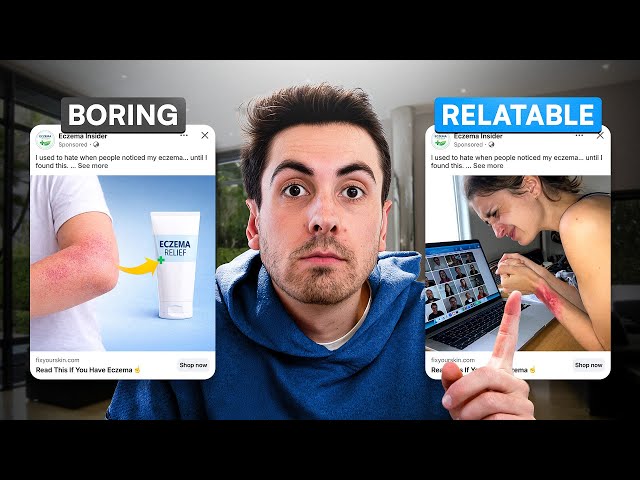
Where the previous lever gives the viewer something, this one withholds it.
The mechanism is an open loop. You introduce information that is incomplete, and the gap creates discomfort the viewer resolves by continuing to watch. It is the same device that keeps people watching a series past midnight.
Three forms work in native placements.
The unanswered question opens the loop directly. Something specific enough to be vivid, vague enough to require watching. The question must feel worth answering, which means it has to touch something the viewer already wonders about.
The withheld reveal shows a result before explaining it. A finished outcome, an unexpected state, a transformation already complete. The viewer stays to understand how it happened.
The interrupted demonstration starts an action and cuts before resolution. This works particularly well in video, where the viewer’s instinct to see something finish is stronger than their instinct to scroll.
Two conditions separate tension from frustration.
The payoff has to arrive. An ad that opens a loop and never closes it trains your audience to distrust your brand, and that damage outlasts the campaign.
The gap has to be proportionate. Too small and nobody notices. Too large and the viewer concludes the answer is not worth the wait.
Two practical notes.
Place the tension in the first two seconds. A loop opened at second eight reaches almost nobody.
Make the resolution contain your product rather than merely precede it. An ad where the answer has nothing to do with what you sell generates views and no revenue.
One caution: this lever attracts curious viewers rather than buyers, which inflates traffic and depresses conversion.
Measure accordingly.
3. Native Ads That Give Before They Sell

This lever reverses the usual exchange. Instead of asking for attention and offering a product, the ad delivers something useful first and lets the product follow.
The mechanism is reciprocity, and it predates advertising entirely. Receiving something creates a mild obligation to reciprocate, even when the giver is a brand and the gift is a thirty-second tip.
Three forms work in native placements.
The actionable tip teaches something the viewer can use immediately, with or without your product. A technique, a shortcut, a mistake to avoid.
The honest demonstration shows the product working in real conditions, including what it does not do. That admission costs you nothing and buys credibility no claim can.
The genuine education explains how something works in your category. Why a material behaves a certain way, what a specification actually means, how to judge quality.
Two conditions separate this from disguised advertising.
The value has to be real and complete. A tip that only works if you buy the product is not a gift, it is a demonstration wearing a disguise, and viewers detect the difference instantly.
The product has to arrive as a consequence, not as the destination. If the viewer feels the entire piece was built to reach the pitch, the reciprocity evaporates.
Two practical notes.
Give away something that costs you nothing but would cost them time. Knowledge you take for granted is frequently the most valuable thing you own.
This lever builds slower and compounds harder than the others. Expect worse first-touch performance and better retargeting results.
It suits categories where buyers research before purchasing, which rules out impulse products entirely.
4. Native Ads That Let Someone Else Do the Talking

This lever removes the brand voice entirely. The ad is someone else’s words, and that distance is exactly what makes it work.
The mechanism is transferred credibility. A brand claiming its product works is making an argument. A customer saying the same thing is reporting an experience, and viewers weight those two statements very differently.
Three voices perform in native placements.
The customer carries the most weight on purchase decisions, because they had nothing to gain from being honest. The strongest versions mention a hesitation overcome rather than offering generic praise.
The creator carries reach and tonal fit. Their audience already accepts their delivery, which means your product arrives inside a format that was never going to be scrolled past.
The employee or founder works where expertise matters. Someone who built the thing explaining a design choice reads as insider access rather than marketing.
Two conditions separate this from staged testimonial advertising.
The language has to stay unpolished. Clipped sentences, imperfect grammar, specific irrelevant details. Cleaning up a review signals copywriting and dissolves the credibility you were borrowing.
The attribution has to be visible. A first name, a photo where possible. Anonymous quotes now read as fabricated by default, because most of them are.
Two practical notes.
Pull testimonials that name a specific objection. “Great product” convinces nobody. “I was worried about sizing and it fit perfectly” answers the question blocking your next buyer.
Let the speaker mention a limitation. A review that admits one drawback is more persuasive than three that admit none.
One regulatory note: testimonial advertising carries disclosure obligations in most markets. Use genuine, unedited material and keep your records.
5. Native Ads That Show a Before and After
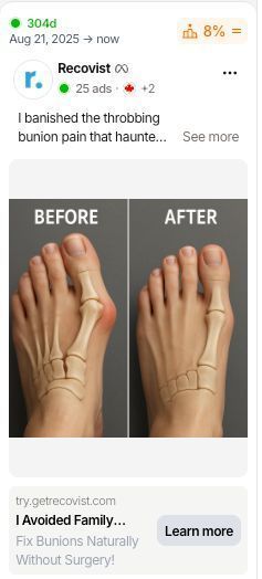
This lever replaces argument with evidence. Rather than describing what your product does, you show the state it changes.
The mechanism is visual proof. A claim requires the viewer to trust you. A visible difference requires nothing, because they draw the conclusion themselves and conclusions people reach on their own are harder to dislodge.
Three forms work in native placements.
The physical transformation suits anything producing an observable result. Cleaning, repair, grooming, organization, restoration. The format is nearly impossible to make dull because the content carries itself.
The process compression shows a long task completed in seconds. Time-lapse delivers satisfaction that still photography cannot, and satisfying content gets watched to completion.
The side-by-side comparison places two states in a single frame. This works where the change is real but subtle enough that sequential shots would lose it.
Two conditions separate proof from exaggeration.
The conditions have to stay identical. Same lighting, same angle, same distance. Any variation reads as manipulation, and viewers have become expert at spotting it.
The result has to be reproducible. Showing an outcome your typical customer will not achieve generates returns, complaints and eventually regulatory attention.
Two practical notes.
Lead with the after rather than the before. The compelling image buys attention, and the viewer scrolls back to understand what changed.
Keep the before authentic. Staging an exaggerated starting state is the fastest way to destroy the credibility this format exists to build.
One regulatory note: before-and-after advertising is tightly regulated in health, cosmetics and weight-related categories. Verify your obligations before publishing.
6. Native Ads That Speak to a Specific Identity

This lever narrows deliberately. Instead of addressing everyone who might buy, the ad addresses one group with enough precision that everyone else scrolls past.
The mechanism is self-recognition. When someone sees their own situation described accurately, the ad stops reading as advertising and starts reading as something written for them.
That shift happens before any argument is made, which is why it outperforms persuasion.
Three approaches work in native placements.
The shared circumstance names a situation rather than a demographic. Not “parents” but the specific experience only certain parents have. Specificity is what triggers recognition, and demographics are rarely specific.
The in-group reference uses language, humor or detail that only the intended audience catches. Outsiders see nothing. Insiders feel addressed personally.
The named frustration articulates something the group experiences but rarely hears acknowledged. Being understood is rarer than being sold to, and it registers accordingly.
Two conditions make this work.
The identity has to be genuinely held. People recognize labels imposed on them from outside, and the rejection is immediate.
The narrowing has to be real. Claiming to address a niche while writing generic copy produces the worst of both approaches: no recognition and no reach.
Two practical notes.
Accept that most viewers will scroll. That is the format working, not failing. Judge it on conversion among those who stop, never on reach.
Write from inside the group if you can. Borrowed insight reads as research, and research reads as marketing.
This lever suits brands with a defined audience and performs poorly on mass-market products where narrowing costs more volume than it gains in resonance.
7. Native Ads That Use Genuine Urgency

Urgency is the most abused lever in advertising, which is exactly why real urgency now outperforms everything else.
Audiences have been trained by countdown timers that reset on refresh and stock counters that never reach zero. The result is a credibility deficit: any pressure now reads as manufactured until proven otherwise.
That deficit creates the opportunity. When your constraint is verifiable, it stands out against a backdrop of fake ones.
Three sources of real urgency work in native placements.
Production limits apply where your capacity genuinely caps output. Small batches, handmade runs, seasonal materials. The constraint exists whether or not you mention it.
External deadlines come from outside your business entirely. Shipping cutoffs before a holiday, a price increase from a supplier, a regulation taking effect. These are the most credible because you obviously did not invent them.
Scheduled availability replaces pressure with anticipation. Products that open on a date and close on another, with the rhythm announced in advance.
Two things make or break this lever.
State the reason. Urgency without explanation reads as a tactic. A specific constraint, explained plainly, reads as information.
Honor the deadline. An offer that quietly returns the following week teaches your audience that your deadlines mean nothing, and that lesson applies to every campaign afterward.
Two practical notes.
Skip visual urgency devices in native feeds. Timers, flashing elements and all-caps warnings signal advertising instantly, which defeats the format.
Deploy this on warm audiences. Someone already considering your product needs a reason to decide today. Someone meeting you for the first time needs a reason to care at all.
8. Native Ads That Disarm Scepticism
Every viewer arrives with an objection already formed. This lever names it before they can use it.
The mechanism is preemptive concession. Raising the weakness yourself removes the viewer’s ability to discover it, and an objection you volunteer carries less weight than one they find on their own.
It also signals something no claim can: you have nothing to hide.
Three approaches work in native placements.
The named drawback states plainly what your product does not do. Not a disguised strength, an actual limitation. “This takes longer than the alternative” costs you nothing with the people who would have discovered it anyway.
The wrong-fit filter tells part of the audience not to buy. Specifying who the product suits poorly makes the claim about who it suits well considerably more believable.
The acknowledged doubt voices the hesitation directly. “You have probably tried something like this before and it did not work” earns more trust than any superlative, because it proves you understand the viewer’s history.
Two conditions make this work.
The concession has to be genuine. A fake weakness, the interview-answer kind, is detected instantly and costs more credibility than saying nothing.
The objection has to be the real one. Naming a minor concern while ignoring the obvious problem reads as deflection.
Two practical notes.
Lead with the concession, not the benefit. Opening with a drawback is unexpected enough in a feed to stop the scroll on its own.
This lever suits crowded categories where every competitor claims the same things. When all the advertising sounds identical, the one admitting a flaw stands apart.
It performs poorly on impulse purchases, where introducing doubt kills a decision that was never deliberate.
9. Native Ads That Mimic the Platform Itself
This is the most literal interpretation of native advertising, and the one with the sharpest line between effective and prohibited.
The mechanism is formal camouflage. The ad borrows the visual language of organic content on its platform, which means it gets processed as content before it gets categorized as advertising.
That half-second of misclassification is the entire advantage.
Three approaches work.
The screenshot format presents content as if captured from somewhere else. A message thread, a review page, a search result. The framing implies the content existed independently of your campaign.
The comment-led creative builds the ad around a reaction rather than a statement. Audiences read comments more readily than captions, because comments come from peers.
The production match simply films the way organic content on that platform is filmed. Vertical, handheld, imperfect lighting, no cuts. On feeds where everything is shot on a phone, studio quality is the thing that signals advertising.
One hard limit governs all of this.
You can borrow the aesthetic, never the interface. Fake play buttons, counterfeit notification badges, false platform labels and anything imitating a native control are prohibited across major platforms and will get your creative removed.
The distinction is simple: looking like content is fine, impersonating the platform is not.
Two practical notes.
Lower your production value deliberately. This is the only format where spending less produces better results, and it is the hardest instruction for brands to accept.
Keep the disclosure visible. Platforms require advertising labels, and attempting to obscure them risks your account rather than just your campaign.
This lever performs strongest on TikTok and Reels, where the organic baseline is genuinely unpolished.
10. Native Ads That Break the Pattern Entirely
The final lever contradicts the nine before it. Instead of blending in, the ad deliberately does not belong.
The mechanism is pattern interrupt. Scrolling is largely automatic, a sequence of rapid dismissals performed without conscious attention. Anything that does not match the expected rhythm forces the brain to actually look.
That forced look is the asset. The viewer has to process what they are seeing before they can dismiss it.
Three approaches work.
The visual anomaly uses something structurally wrong. An unexpected color field, an image rotated, a frame that stays empty while everything around it moves. The viewer stops because their eye could not categorize it.
The format mismatch places content where it does not belong. Something that looks like a document in an entertainment feed, something deliberately low-fidelity among polished competitors.
The tonal rupture says something no advertiser would say. A flat admission, an absence of enthusiasm, a statement that reads as oddly honest for a brand.
Two conditions separate interruption from noise.
The break has to lead somewhere. Stopping the scroll with no payoff produces irritation, and irritation attaches to your brand rather than your ad.
The anomaly has to be relevant. A random shock image stops attention and delivers nothing, which trains viewers to dismiss you faster next time.
Two practical notes.
This lever degrades fast. Once a pattern interrupt becomes familiar, it stops interrupting anything. Expect a shorter lifespan than the other nine and plan rotation accordingly.
Use it on cold audiences where recognition does not exist yet. On warm traffic, breaking your own established pattern confuses people who already know you.
One warning: this is the hardest lever to execute and the easiest to get wrong.


Ready to build a million-dollar brand?